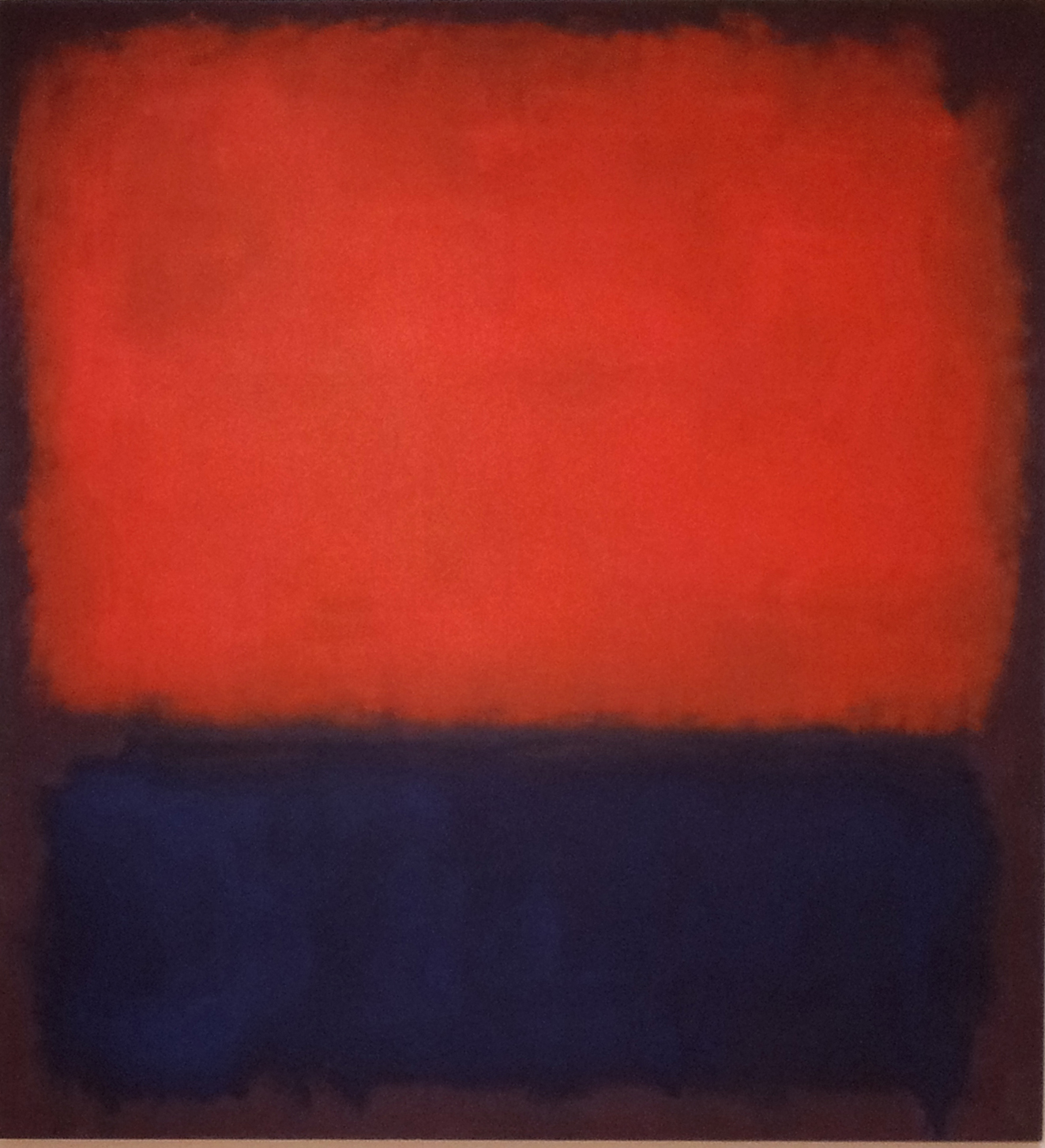
Mark Rothko
Back to the topic of colour combinations, this time its red and blue, an all-time fashion favorite. Why? The hot red is perfectly balanced out by the cold blue. Its bold, clean and sharp to look at. This combination really needs bright, natural sun light to set it off, therefore usually seen in spring and summer outfits.
And it seems they understood this very well in the Renaissance:
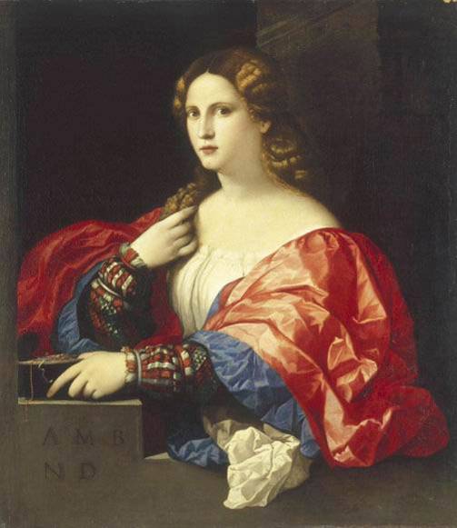
Palma il Vecchio, La bella, 1518-20c,Thyssen-Bornemisza Coll, Madrid, Spain
A slight variant of red and deep purple from later in the 1500s:

Trachten buch, Habitus praecipuorum, Neapolitan lady, 1577
Despite the invention of artificial dyes in 1853 (when just about any daring colour combination became possible) red and blue remained a constant of the 1800s and the 1900s:
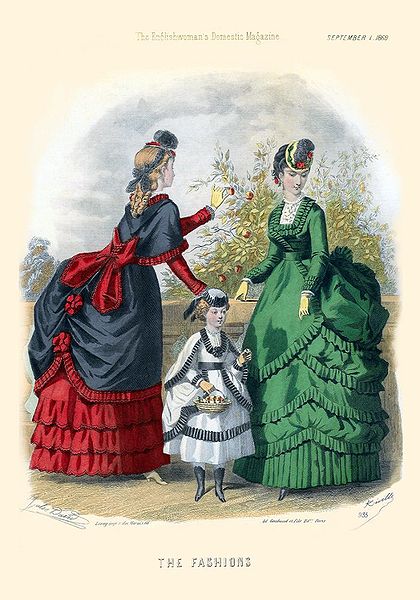
Englishwoman’s domestic magazine, fashion plate, September 1869
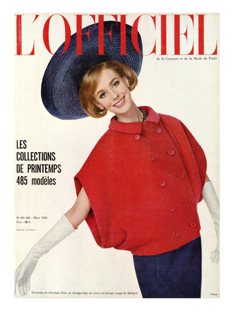
L’Officiel, photo: P. Poittier, outfit: C.Dior, 1963
Men’s fashion is not immune to this colour combination either, although as we can see in the examples below, there is also an element of sports uniform (especially in the stripe motif)

Cordings, Uk, striped sock, 2014
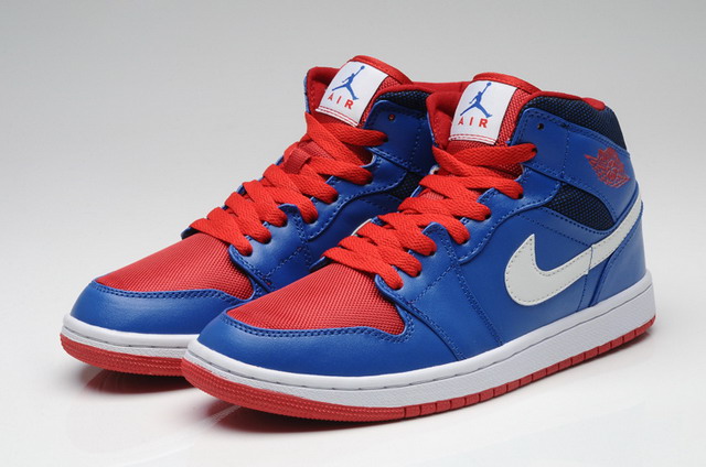
Nike, Air Jordan retro
And finally a non-western take on this colour combination: shades of red/fuchsia and blues as used by Tibetan monks still today

Just shows that clothing and colour can be a spiritual experience, some combinations can have a deep emotional impact on wearer and onlooker.

its one of those colour combinations that never seems to do much for me though – now blue and yellow, that’s a different matter!
LikeLike
Blue and yellow: that one is on the list too!
LikeLike
amazing post!!! Loved it well done you xxxx
Dr Henrietta Bowden-Jones MRCPsych, BA(Hons), DOccMed, MD(Imperial), FRSA
WEBSITE: http://www.henriettabowdenjones.com
ACADEMIC WEBPAGE:http://www1.imperial.ac.uk/medicine/people/h.bowdenjones
>
LikeLike